Over the years a lot of people have had trouble spelling my name. When I was younger I assumed they hadn’t heard the name “Colin.” It was pretty unusual where I lived. Over the past twenty years the name has become more popular but the spelling trouble hasn’t improved. It turns out these days there’s another problem: an alternative spelling. Could “Collin” really be as common as “Colin”? I didn’t believe it.
Luckily the Social Security Administration keeps track of first names by date of birth and they make this data freely available, so I could answer that question.
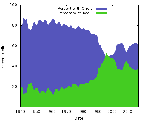
As it turned out “Collin” experienced an dramatic jump in popularity around the turn of the century, momentarily eclipsing the (correct, of course) “Colin.”
The graph shows the relative popularity of “Colin” vs. “Collin for people born since 1940. In 1940 about 85 percent of the two names were using one “l” which persisted into the late seventies; the two “l” variant took off quickly and briefly surpassed the single “l” version around 1999 before drifting lower ever since.

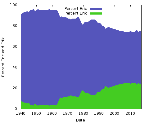
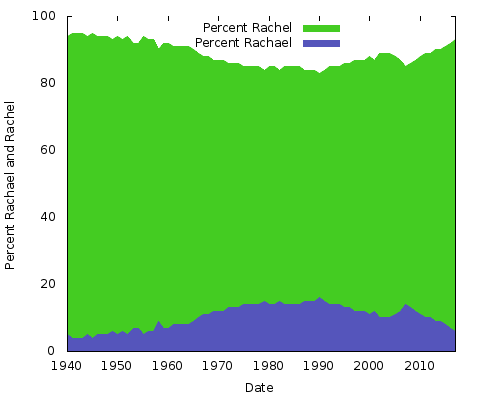
What does it all mean? I have no idea. Whatever the reasons, they will be different for other pairs of name spellings. You could do the same for “Eric” vs. “Erik” or “Rachel” vs. “Rachael” and many others. Actually, let’s do those two:


These are simple area charts. For this purpose I prefer it to a stacked area chart; with only two lines, where the sum of the two Y-axis values always amounts to 100% you’d just end up with the same bottom line and the top half a solid color. This way you get a better idea of the big change in popularity of the two spellings.
A stacked area chart would be great for showing trends of more than two names: For instance you could show change in sex associated with names over time with just one name using a chart like the one above, but using one image you could stack multiple names and convey the same information: [Sidney-F, Taylor-F, Sidney-M, Taylor-M]
Social Security Baby Name Data
The data comes from the SSA website where they make the top 1000 most popular baby names publically available for every year of birth in their records. Before 1940 the data is pretty sparse, since the administration was only set up in the thirties. You can still get names going back to 1880 but there are fewer since only people who enrolled in the thirties and later are included.
Get the data on this SSA page. It comes in a .zip archive holding separate files for every year of birth, and there’s a version of the data broken out by U.S. states.
The data look like
Linda,F,99686
Mary,F,71688
Patricia,F,51278
Barbara,F,48791
Sandra,F,34774
Carol,F,33538
Nancy,F,32442
This is from the top of the 1947 file.
You’ll want to combine the single year files into one and probably add a “Year of birth” (YOB) column to make using it easier for time related graphing. I wrote a small Ruby script to do the job.
To feed data to a graphing package you’ll probably need to massage the data some more: You need to transform the rows with a single name into rows with columns for all the data points you want to graph. These might be in one file or one file per line in the graph (Gnuplot let’s you work that way, loading multiple files into one graph.) You could do this with Ruby or Python. I did it with SQL and the “Q Text-as-Data” tool, then fed the result to Gnuplot.